
Hello OPA Racers and Race Fans,
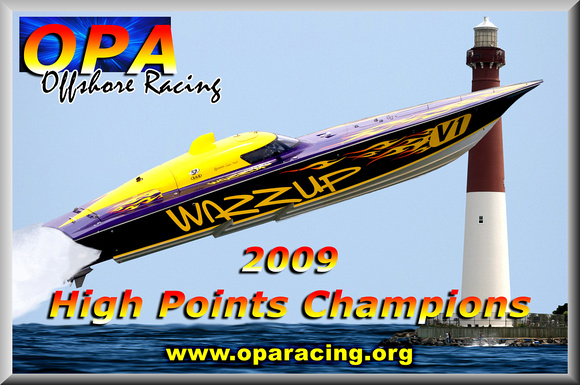
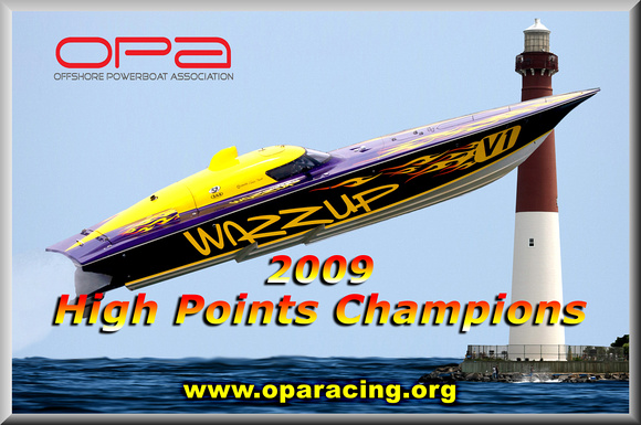
As we move toward the start of the 2010 racing season youll notice some changes being made along the way. The goal of these changes is to elevate the image of OPA both on and off the race course and to make OPA a more marketable property. The first and most distinguishable change is our new logo. As you can see, this logo is far more contemporary and more in line with what sponsors expect to see from a professional motorsport.
Dont worry, we havent given up tradition, well still use the High Points Champion logo on the boats, but for all other communications and web site graphics, this will be the new one.
Look for more news to come as the weather gets warmer.
See you at the Party,
Smitty, Augie and Louie
Thread: OPA gets a new Logo
Results 1 to 20 of 31
-

 OPA gets a new Logo
Charter Member / Competitor
OPA gets a new Logo
Charter Member / Competitor

- Join Date
- Oct 2008
- Location
- Jersey Shore
- Posts
- 372
01-20-2010 04:42 PM
-
-
Charter Member
- Join Date
- Oct 2008
- Location
- Toms River, NJ
- Posts
- 56
 01-20-2010 05:18 PM
Great decision OPA.The new logo looks great
01-20-2010 05:18 PM
Great decision OPA.The new logo looks great Originally Posted by Ron P

-
Competitor / Charter Member

- Join Date
- Apr 2009
- Posts
- 2,286
01-20-2010 05:26 PMvery rich looking, good job
IMCO #10- 2009 National Champions
-
Registered

- Join Date
- Nov 2008
- Location
- long Island,N.Y.
- Posts
- 1,290
01-20-2010 06:40 PMNice but where is the gun&the bat?
-
Competitor

- Join Date
- Nov 2008
- Location
- Beachwood NJ
- Posts
- 84
01-20-2010 06:45 PMLove it
-
Competitor

- Join Date
- Nov 2008
- Location
- Franconia, PA
- Posts
- 140
01-20-2010 08:32 PMThey aren't what a sponsor expects from a professional motorsport. Originally Posted by Slandrew
Nice job on new logo.Rich Smith
Smith Brothers Offshore Racing Team
Cotnertrailers.com 611
-
Registered
- Join Date
- Nov 2008
- Location
- long Island,N.Y.
- Posts
- 1,290
01-21-2010 07:35 AMIt was a joke meat head! Originally Posted by sbracing

-
Charter Member

- Join Date
- Oct 2008
- Posts
- 577
01-21-2010 09:25 AMgood job ,the new logo looks great
ROCK ON !!!!!!!!!!!!!!!!!!!!!!!
ITS A SKATER NATION !!!!!!!!!!!!!!!!!!!!!!!!!!!!!!!!
DRYDEN PERFORMANCE MARINE 302-367-4962
-
Sponsor

- Join Date
- Nov 2008
- Location
- LOTO
- Posts
- 797
01-21-2010 09:35 AMLooks nice Ron!
Some days your the fist and some days your the face!
-
The Godfather

- Join Date
- Oct 2008
- Location
- JERSEY! Where Else.
- Posts
- 524
01-21-2010 12:25 PMThat's The Jersey Boyz Logo. SB is kinda right, either way I hate the new logo! But we'll come to some agreement! Originally Posted by sbracing
Last edited by AugiePensa; 01-21-2010 at 04:04 PM.
.......Augie Pensa.......

The Godfather
-
Competitor
- Join Date
- Nov 2008
- Location
- Franconia, PA
- Posts
- 140
01-21-2010 07:23 PMStifle , Archie! Originally Posted by Slandrew
Rich Smith
Smith Brothers Offshore Racing Team
Cotnertrailers.com 611
-
SHARKEY-IMAGESGuest
 01-21-2010 09:40 PM
I hope this means I don't have to start all over...... Originally Posted by Ron P
01-21-2010 09:40 PM
I hope this means I don't have to start all over...... Originally Posted by Ron P

New one looks cool too though....
Last edited by SHARKEY-IMAGES; 01-21-2010 at 11:15 PM.
-
Registered

- Join Date
- Oct 2008
- Location
- Mentor, Ohio
- Posts
- 1,827
01-21-2010 10:18 PMVery nice, looks great!
-
Competitor

- Join Date
- Apr 2009
- Location
- Jersey Shore
- Posts
- 265
01-22-2010 12:26 PMwell done guys..very professional & classy. I love the old stuff too, and when it was just us banging around in our backyard, they were great. Smitty & crew are moving the organization forward, and in a big way. This is a small, but significant, step in that direction. See you @ Awards Party...
-
Charter Member / Competitor
- Join Date
- Oct 2008
- Location
- Jersey Shore
- Posts
- 372
01-22-2010 03:25 PMOk, lets try this again.
Thanks to 2 Trick Rick, we have a new and improved logo. We are done. This is now the official 2010 OPA logo.
You can go to www.oparacing.homestead.com and download the new logo as well as the flaming boat logo.
Thanks Rick!!!! This is now a logo we can all feel proud of. about.
-
SHARKEY-IMAGESGuest
01-22-2010 06:44 PM
Thanks guys !!! Great work !
I have made a decision to stick with the original logo on any images that were taken prior to 2010 .
The 2010 Racing Season's images will sport the new logo if needed.
-
Registered
- Join Date
- Nov 2008
- Location
- long Island,N.Y.
- Posts
- 1,290
01-23-2010 08:00 AMWhat about this 1??

-
Charter Member

- Join Date
- Oct 2008
- Location
- Serious is the BOMB!
- Posts
- 7,073
01-23-2010 11:24 AMnothing personal, just my opinion... i liked the old new logo better than the new new logo. To me that red, white and blue prop... that idea is just so overdone and over used. MLB uses it the NBA uses it, golf uses it, he uses it, she uses it... to me it just screams that little Billy got photoshop and turned his skateboard, bicycle, nintentdo, rc car, or popcicle into a logo. There is just no originality, no distinction or anything to catch my eye in it. IMHO something over-used and over-done gets ignored not noticed.
P-4077 "The Swamp" S.B.Y.C. and Michigan medboat mothership
-
The Godfather
- Join Date
- Oct 2008
- Location
- JERSEY! Where Else.
- Posts
- 524
01-23-2010 12:38 PMThat's fine Sharkey. I'm like the old one too! Originally Posted by SHARKEY-IMAGES
.......Augie Pensa.......
The Godfather


Posting Permissions
- You may not post new threads
- You may not post replies
- You may not post attachments
- You may not edit your posts